
I redesigned the cancellation flow at Freeletics to make the process clearer, more transparent, and less frustrating for users. Based on real complaints, we added options like a subscription reminder and the ability to pause in specific cases.
After launching an A/B test, we saw a 22% drop in cancellations related to the main complaint, and a 4% reduction in overall churn — showing that even small, well-placed changes can make a real difference.e
At Freeletics, most users purchase their subscriptions through the website, but their day-to-day interaction with the product happens entirely in the app. When it came time to cancel, this disconnect led to confusion: there was no clear way to manage subscription settings from within the app itself.
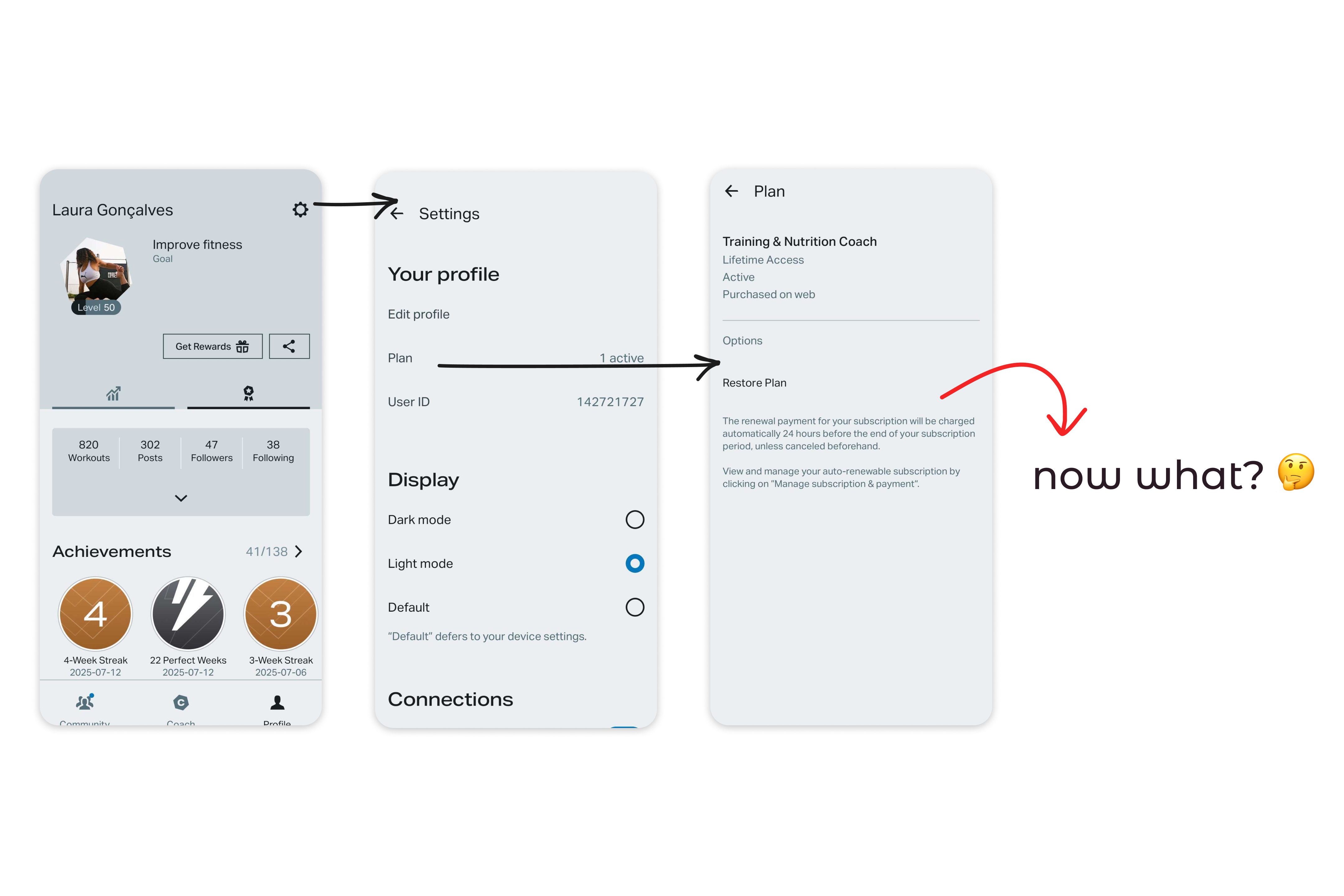
Previous plan page with no options to cancel
The result? A wave of support tickets to the Customer Experience Team and a string of negative reviews in the App Stores. Not only did this hurt our support team’s bandwidth, but it also damaged user trust and potentially discouraged new users from signing up.
The goal was, then, designing an Offboarding Flow within the app that would:
To understand why users were cancelling their subscriptions, I analyzed results from our ongoing Cancellation Survey — a SurveyMonkey pop-up that appears right after someone cancels via the website. While the data provided useful insights, it came with a catch: only a small percentage of users actually respond to it ( less than 15%), so results should be taken with a grain of salt.
In parallel, I reviewed complaints from both the App Store and Google Play reviews. One theme popped up repeatedly, and it wasn’t news to the team: subscriptions renewed automatically without any reminder. While users were clearly frustrated by this, the auto-renewal model was a deliberate business decision, and, so far, not something up for change.
I also explored how other products handled subscription cancellations to gather inspiration. The most striking example was Spotify — a relevant comparison, since purchases there can also originate from various platforms. At former times, they also added a “goodbye” playlist to the flow. It brought a light, human touch to a tedious and transactional process.
Taking all of this into account a pattern began to emerge: most cancellations were driven by a few recurring and sometimes preventable frustrations. That sparked an idea:
What if we acknowledged these pain points upfront — and offered timely, targeted solutions before the user even hit “cancel”?
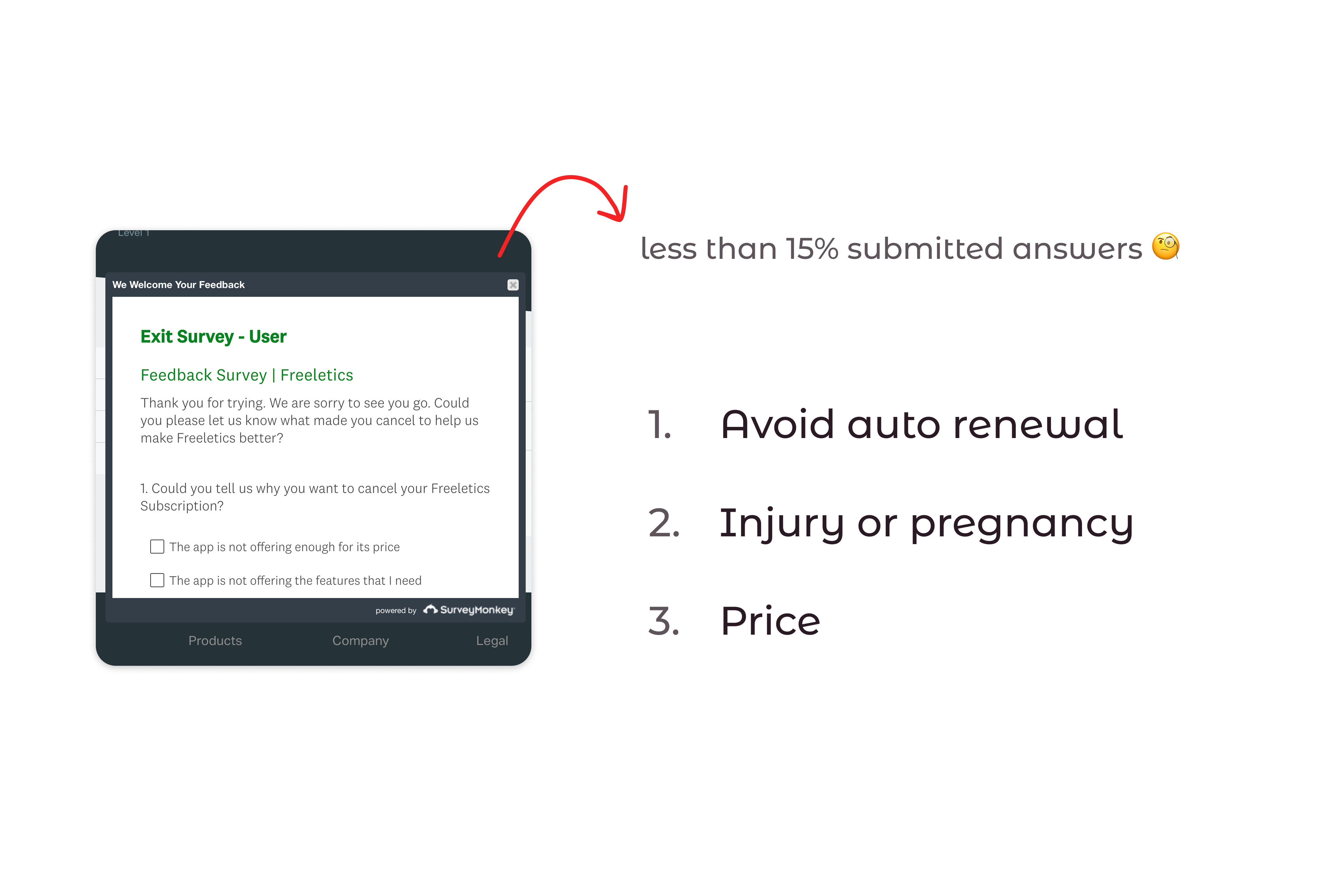
Main susbcritpion cancellation reasons
After identifying the main reasons users were cancelling, I brought a proposal to the team: Start the cancellation flow with a short survey to gather more reliable data. This would help us better understand what users felt was missing and turn that into actionable insights. Right after completing the survey, users would land on a screen that addressed their specific concern. Wherever possible, we’d offer a solution to help them stay with Freeletics while still giving them the option to cancel if they chose to.
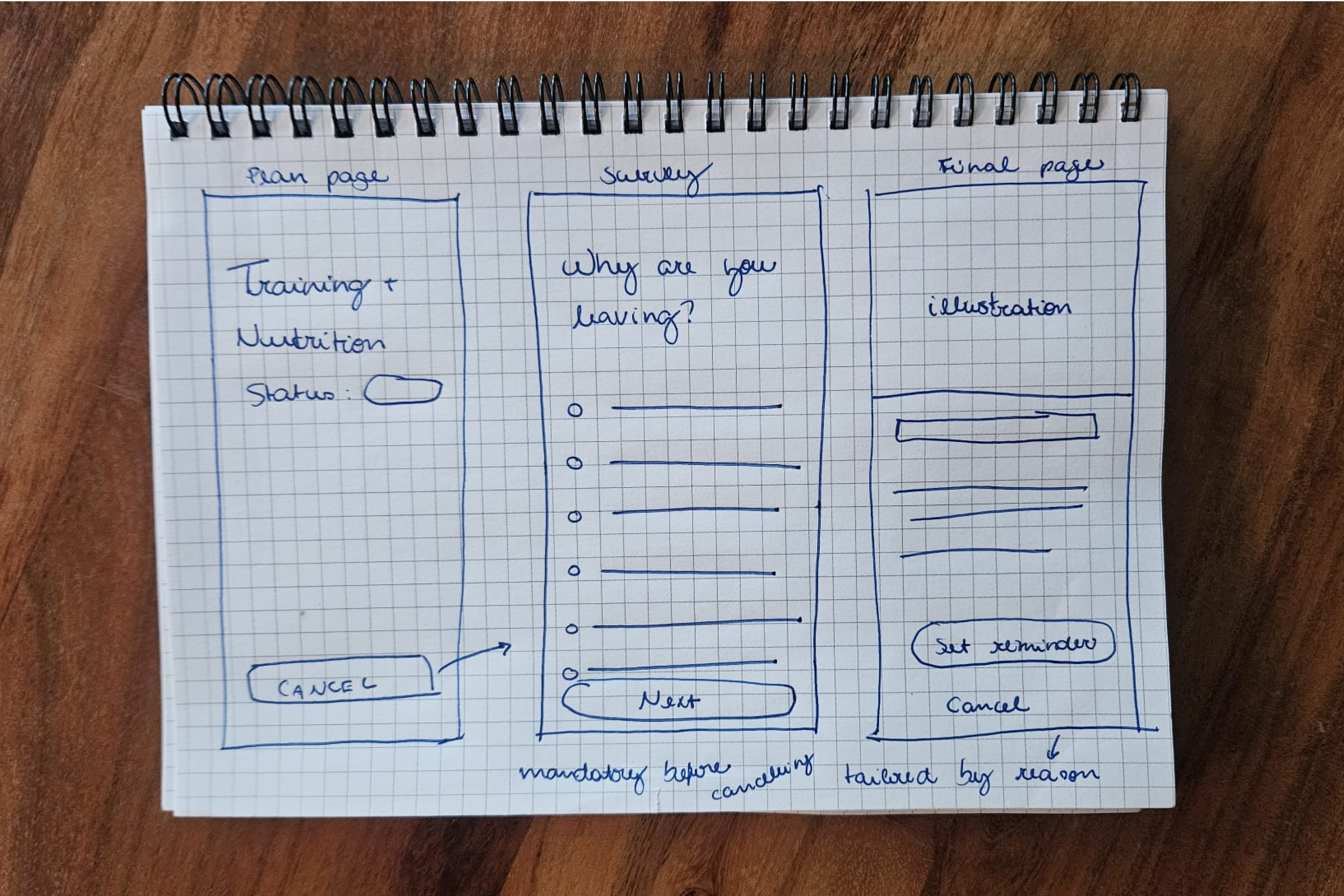
Hand-drawn sketch showing main ideas for the flow
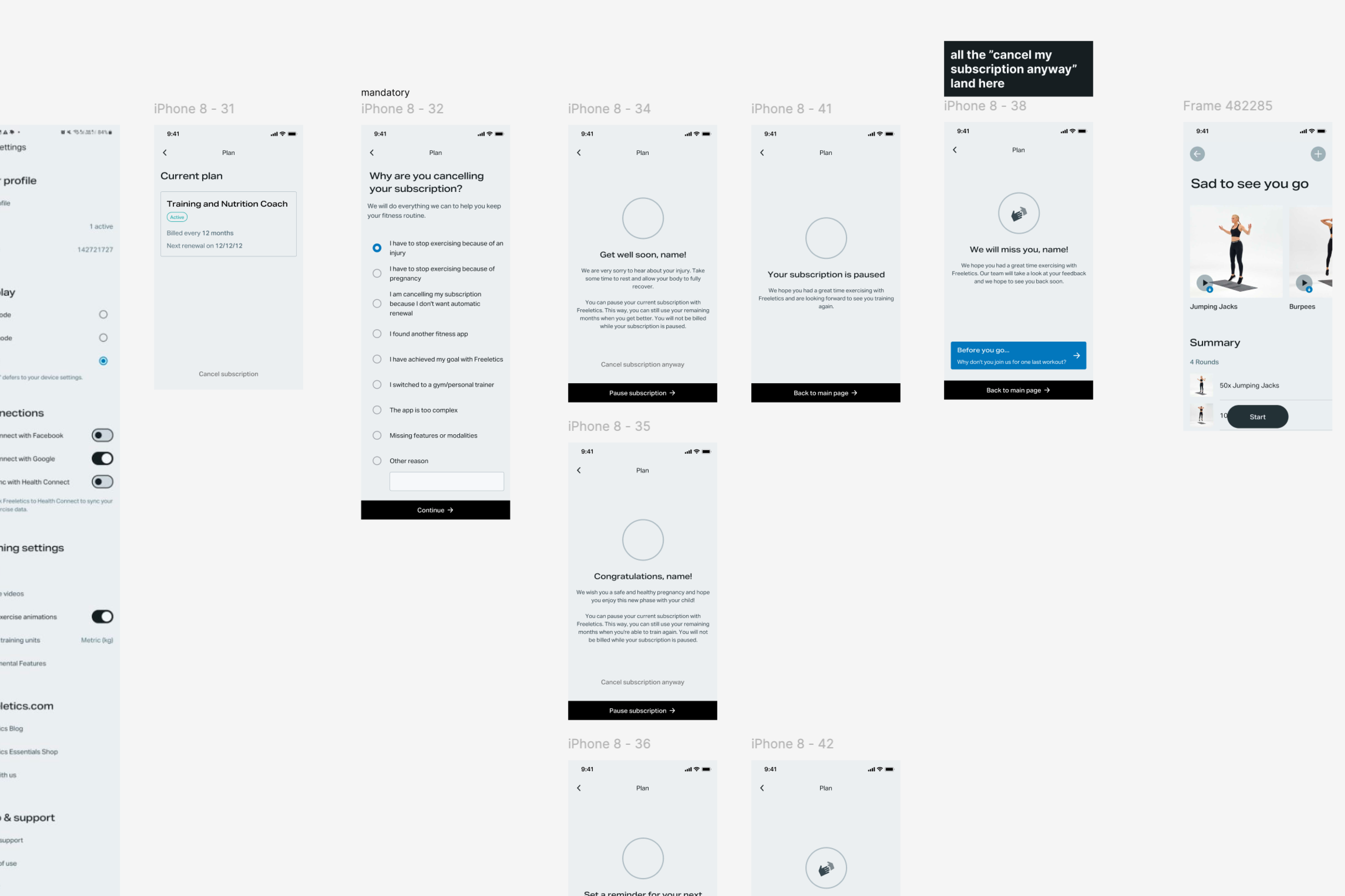
Wireframe with examples of proposed flow
I translated this idea into a wireframe and brought it to our pre-refinement meeting. This is a session where I present early-stage design ideas for feedback from developers and the Product Manager. (Curious about how I run these meetings? I wrote this post [TK WITH LINK] explaining the format and why it works.) During this discussion, we uncovered two important opportunities:
I also partnered with the Product Manager to pitch an optional renewal reminder feature. This was aimed at users who still liked the product but wanted to avoid the dreaded surprise charges. In this conversation with the team, we also agreed that it wouldn’t be feasible to address every cancellation reason from the start. Instead, we decided to focus on the most common and actionable ones: unexpected renewals and users wanting to take a break due to injury or pregnancy.
To keep delivery manageable, we split the work into two phases:
After aligning with the team, I had a clear picture of what was feasible to deliver, including the technical limitations of each platform and the content flexibility we had. With the PM’s support to introduce a renewal reminder flow, it was time to turn insights into screens.
My main goal was to create an experience that allowed us to gather data and offer alternatives without overwhelming users. After all, cancellation is a sensitive moment, and by this point, many users are already feeling frustrated or let down by the brand.
I focused on keeping the flow simple, clear, and user-guided. The design was built around three core templates, adapted to each user context:
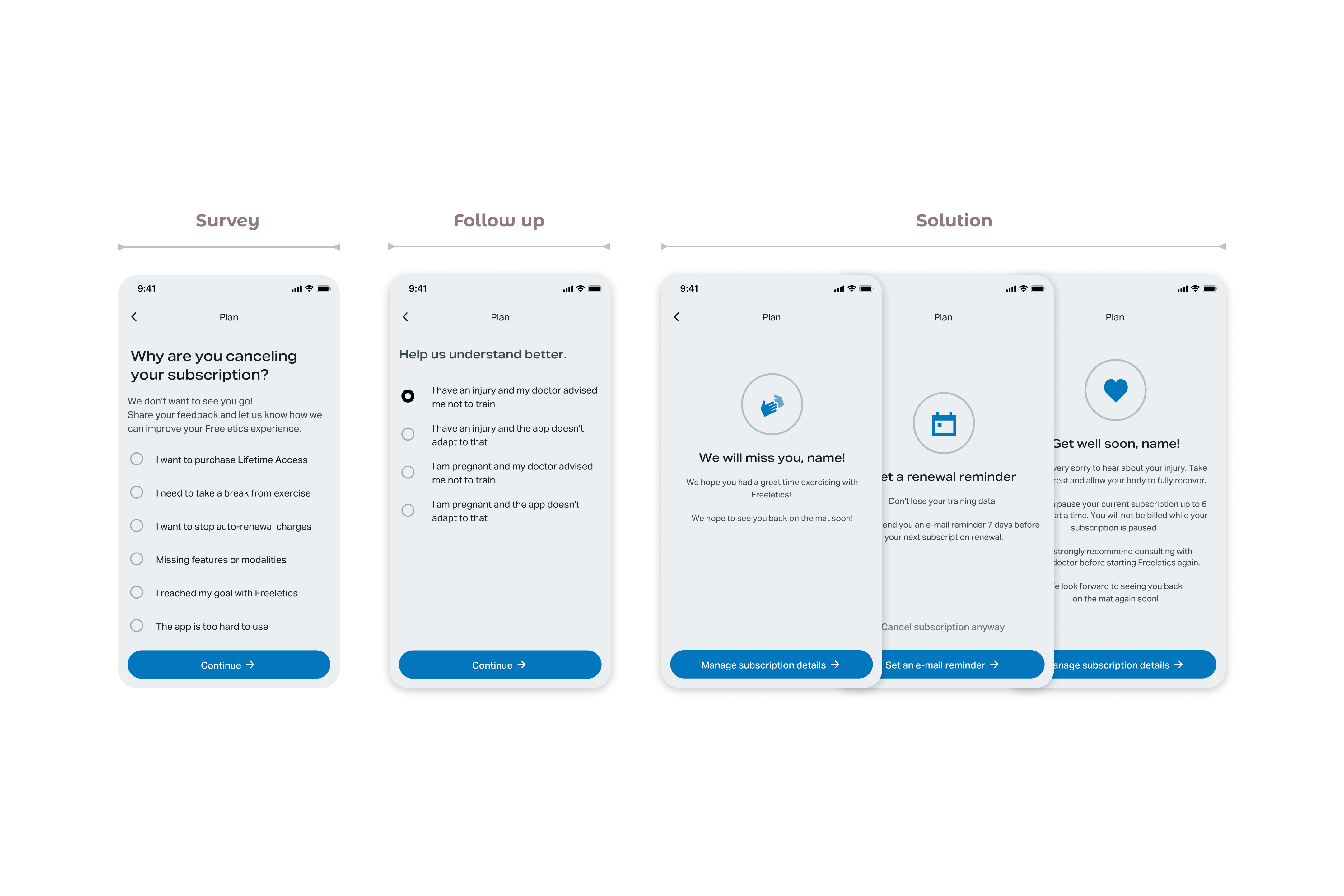
Template and variations for the "solution screen" at the end of the flow
Inspired by Spotify’s “goodbye playlist,” I also proposed a Goodbye Workout: a session users could save and complete later. It was meant to leave them with a positive final touchpoint. Unfortunately, due to time and development constraints, we had to discard this idea.

Thre planned goodbye workout
For the Plan Page redesign, my focus was on clarity and predictability. I wanted users to quickly understand their subscription details such as status, renewal dates, and purchase method without digging through menus or reading through walls of text. I introduced color-coded tags for subscription status and rearranged the layout to make key information more scannable at a glance.

Plan pages
As mentioned earlier, each platform came with its own limitations and capabilities when it came to subscription management. This meant I had to design and deliver slightly different flows for users who purchased subscriptions via Android, iOS, and the Web: sometimes just one extra sentence, sometimes an additional button.
To keep the handoff organized and manageable, I structured the documentation in clearly separated sections, one for each platform. Each flow was clustered in its own area, with visual cues and clear annotations to help developers quickly navigate the file. Flowcharts and directional arrows are a must for me in any dev handoff, so I included them as part of the package.
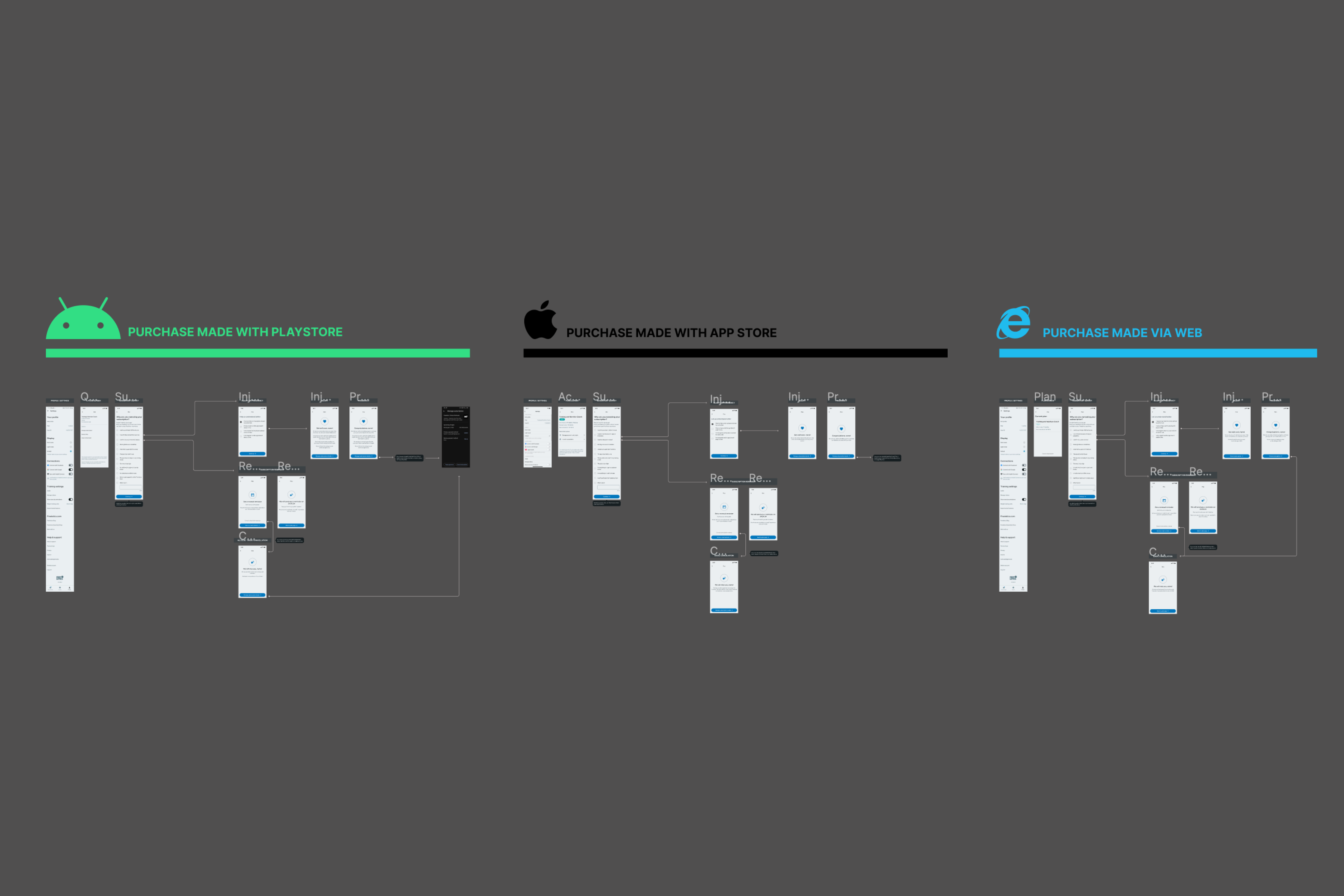 Screenshot from Figma showing Web, Android, and App
Store flows
Screenshot from Figma showing Web, Android, and App
Store flows
The Plan Page handoff followed a similar logic. Since there were many plan variations and combinations of details that could appear, I decided to deliver this part as a single-page guide. It included all the possible variant options and edge cases in one place — a strategy to help both me and the developers stay aligned and avoid confusion from too many near-identical screens.
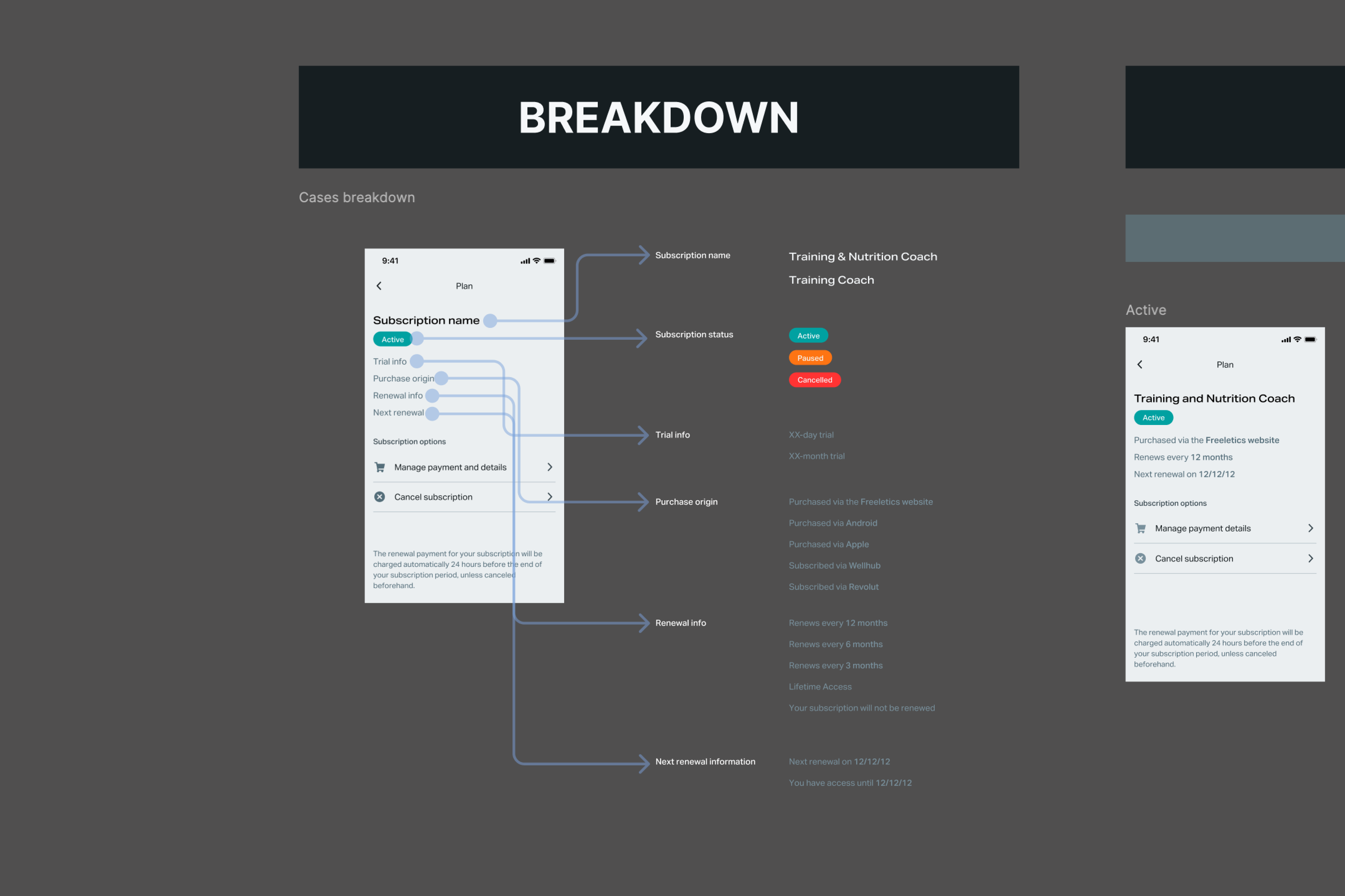
Plan Page handoff
The PM recommended launching the new flow as an A/B test to assess whether making cancellations easier would lead to an increase in churn. The opposite happened: while more users explored the new flow, fewer actually followed through with cancellation on the variant side.
The subscription reminder proved to be the most effective alternative, with 22% of users selecting it and choosing to stay. The pause subscription option was less popular, likely due to its limited availability — only for Android users via the Play Store, and only in certain countries.
With the addition of the subscription reminder feature, we managed to retain more than 1k users who were about to leave Freeletics — resulting in a 22% reduction in the churn rates for this specific reason. The overall impact in cancellation rates across Freeletics was a reduction of 4%.
This flow reminded me that good UX isn’t just about guiding users — it’s about listening, even when they’re halfway out the door. Turns out, helping people leave gracefully is sometimes the best way to make them stay.